|
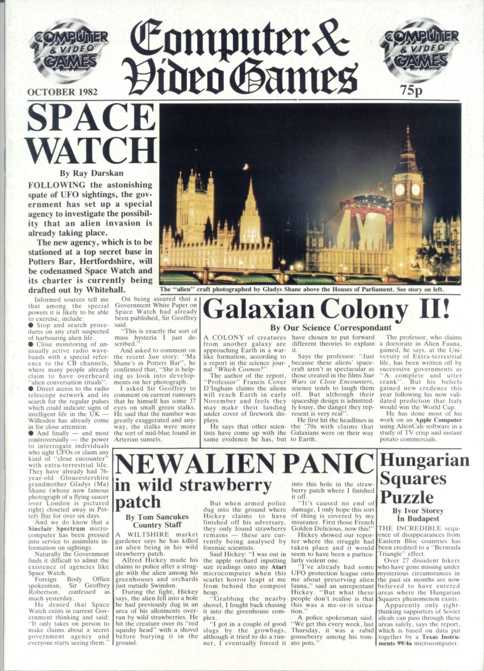
WORTH A THOUSAND WORDS
The Art Of C&VG
Last month’s The
Definitive Frogger left even RG’s dedicated historian Stuart Campbell’s
with a brain so broken that he couldn’t face doing any complicated research
this month. So we gave him some nice pretty pictures to look at instead.
The magazine you hold in your hands,
viewers, is the last of its kind. Now, don’t panic – Retro Gamer
isn’t about to close down. (Or at least, if it is nobody’s told me
about it. Come to think of it, where IS last month’s pay cheque?)
But there’s something RG does, that used to be enormously
commonplace, but which no other videogames magazine has done for
years. Can you guess what it is? See if you can figure it out before
I tell you, which will be in about three paragraphs’ time.
Most of the publications you’ll find
on the videogames shelf at your local newsagents aren’t “magazines”
in the traditional sense of the word at all – they’re glorified
sales brochures, produced by people who quite openly see themselves
not as the servants of their readers but as extensions of the games
industry’s PR sector. (Almost the entire writing staff of one
widely-respected current title, for example, resigned a few years
ago when they were told by their own management, among other things,
that they couldn’t give games published by Sony review scores lower
than five out of ten.) By comparison, 25, 15 and maybe even 10 years
ago, games mags were primarily a hobbyist affair, written for (and
by) a community of dedicated enthusiasts as the only means of
sharing information about their common pastime.
Because most game publishers were tiny
little companies operating out of someone’s back bedroom or a flat
above a chip shop, there were no big marketing departments around to
either dazzle reviewers with expensive promotional trips to exotic
foreign lands, or bully them with threats of withdrawing thousands
of pounds in lucrative advertising in one fell swoop. Combined with
the absence of the internet - leading to circulation figures on
average two or three times that of a modern games mag, despite the
much smaller total number of gamers in existence – this situation
led to a relative financial stability when it came to planning the
magazine’s budget. So that’s one thing.
Here’s another thing: nowadays, sleek,
glamorous, state-of-the-art publications like Retro Gamer take
advantage of superb modern screenshot technology to produce
beautiful images of games. Whether it’s giant blown-up single shots
or lovely pieced-together maps showing entire gameworlds at a single
glance, it’s easy for us to show you exactly what a game looks like.
Readers (and mag editors) take this technology for granted now, but
in bygone times (even as recently as the early 1990s, when your
reporter first joined the massed ranks of videogame journalism),
things weren’t quite so simple.
Back in those days, publishing was
still largely a physical business as opposed to a digital one, and a
great many magazines still illustrated reviews and the like by the
primitive (and expensive) method of having a photographer point a
stills camera at the TV screen while the game was being played, and
taking a picture of it. It’s difficult on a technical level to
photograph moving images on a TV screen, though, and this method
delivers extremely variable results (especially when printed in
black-and-white, as many games mags still predominantly were
throughout the 1980s), and some publications – one in particular -
chose to find a rather more creative solution to the problem.
If you’re a bit slow, or can’t stand
the tension any more, or just realised immediately on looking at all
the great big pictures splashed all over the place, we’re talking
about custom artwork – and specifically that which was found in the UK’s first
and longest-running (23 years, until it was bought and closed by a
rival publisher in 2004) games magazine, Computer And Video Games.
Once a staple of the videogames
journal, hand-drawn and painted illustrations compensated for crude
1980s graphics and primitive production methods, but also helped to
give magazines like Crash, Zzap and Your Sinclair the individual
senses of character and personality that made them stand out from
each other. In the modern world that loss of character has been one
of the factors causing sales to plummet, as paper publications fail
to cultivate a unique identity that would help give them a selling
point over the fast-moving but bland and corporate world of internet
games journalism.
But the editors of the 1980s would no
sooner have contemplated doing away with custom artwork than today’s
editors would try to live without rehashed press-release “news”,
pre-supplied “interviews”, generic preview “screenshots” taken from
cutscenes, and advertiser-approved “review” scores. (Enough with
the “quote marks” – Ed) Artwork was an intrinsic, obvious and
non-negotiable part of magazine creation, so before we descend any
further into the gloomy abyss of modern mainstream games mags and
get all depressed, let’s take a few pages out of our busy schedule
to celebrate the halcyon days of the videogames illustrator, and
perhaps offer a silent prayer of gratitude that at least one
publication (this one, if you’ve forgotten) is doing its bit to keep
a tiny, flickering flame alive.
------------------------------------------------------
THE POWER OF SUGGESTION
(Part 1)
------------------------------------------------------
As videogames journey ever further
into the Uncanny Valley (the name for the psychological phenomenon
whereby the closer graphics get to photorealism, the more our brain
concentrates on what’s wrong with them, in order to prevent us from
being fooled by fakes), custom artwork takes us on a trip to the
opposite end of the spectrum, where the crudest of all possible
visuals leaves space for our imaginations to fill in a scene far
more evocative than any graphics card could depict. Take a look at
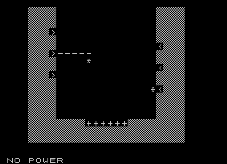
this example from C&VG’s June 1983 issue. It’s the facing page from
a type-in ZX81 program called “Cannon Master”.
The black-and-white in-game graphics
showed you in command of a few arrows shooting minus-signs at
asterisks in a big “U” shape. But thanks to Jon Davis’ illustration,
when you actually played the game your mind saw you perched high up
in the sky above a dusty, windswept desert canyon, manning huge gun
emplacements charged with protecting your army’s vital fuel dumps
against a deadly hail of enemy rockets fired by an unseen enemy. The
game graphics are just placeholders for the mental image, and your
brain fills in the “photorealism” for itself. (If you want to
experience the sensation, I’ve personally typed in the entire game
and saved it as a file for use with ZX81 emulators - you can
download it from the forum of my website at
www.worldofstuart.co.uk.
Let nobody say we don’t go the extra mile for our viewers here at
Retro Gamer.)
-------------------------------
FRONT AND CENTRE
-------------------------------
C&VG took particular pride in its
front covers, and they encompassed a dizzying range of styles in the
mag’s first few years. (While illustrations would continue to be
used inside the mag right through the 1980s, the cover would be
increasingly given over to PR shots of commercial releases from
around the middle of 1984. Until that point, the cover would often
be devoted to one of the magazine’s own type-in games rather than a
retail title.) While a core team of artists – each with their own
distinctive style - provided most of the artwork, occasionally the
net would be cast rather wider to produce something even more
esoteric.
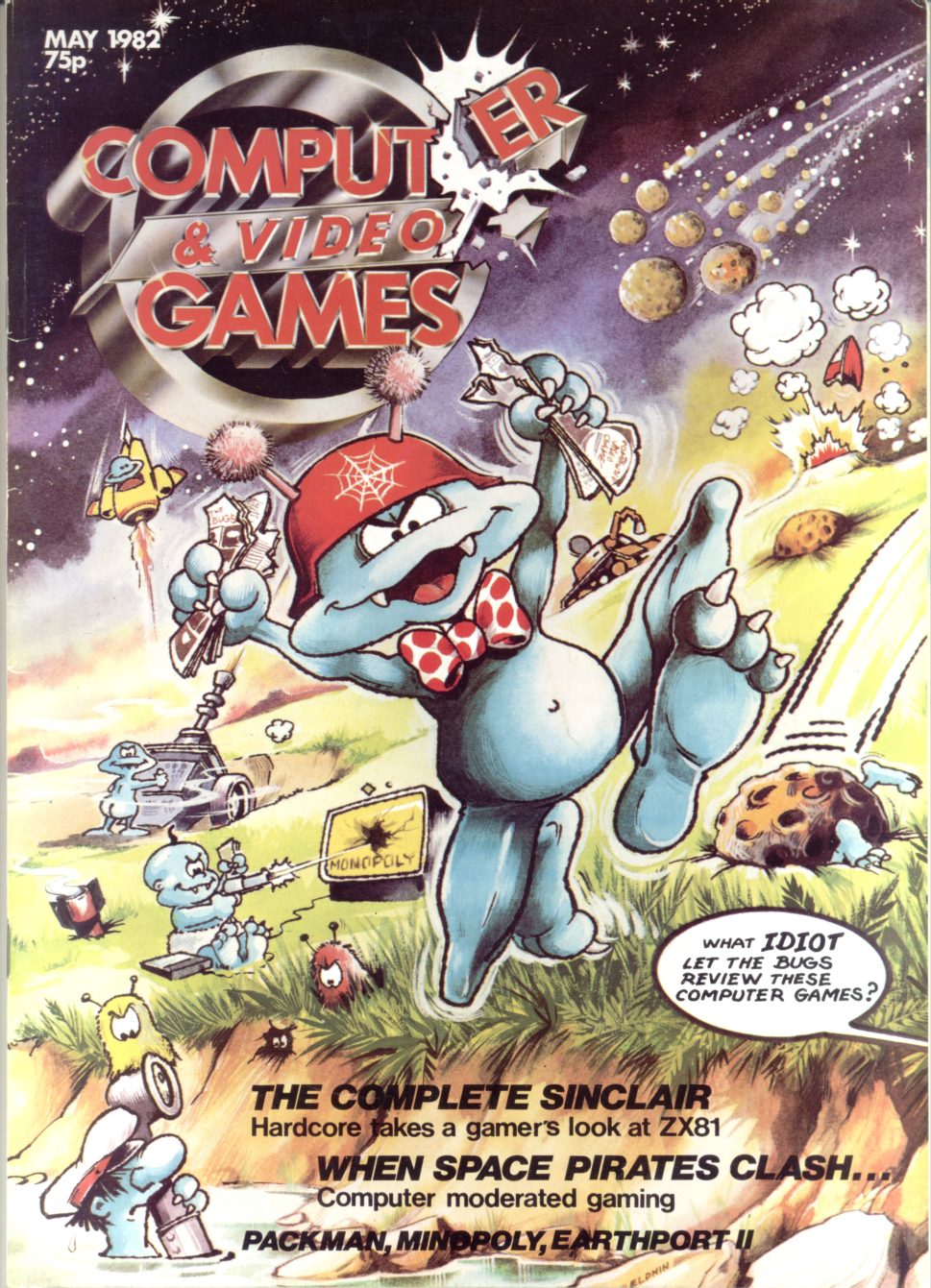
“The Bugs”, drawn by Elphin
Lloyd-Jones, were C&VG’s mascot characters, and featured in their
own full-page comic strip inside the magazine, as well as cropping
up in all manner of random corners elsewhere. This cover from Issue
7 in May 1982 shows them depicted in their full-colour glory for the first time.
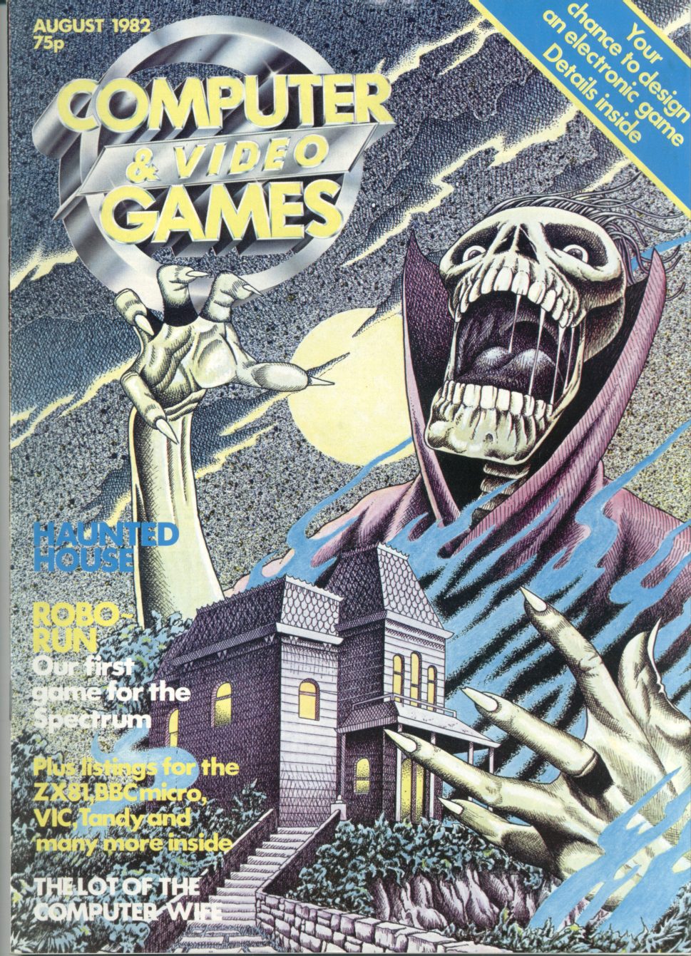
The next image, by Stuart Briers for the
August 1982 issue, combines the spooky horror skeleton with an
obvious homage to the famous Alfred Hitchcock thriller “Psycho”, in
the shape of the trademark house on the hill. If you look really
closely, you can just make out the malevolent shape of Mrs Bates in
the window. (NB Mrs Bates may not be visible in this reduced
reproduction.)
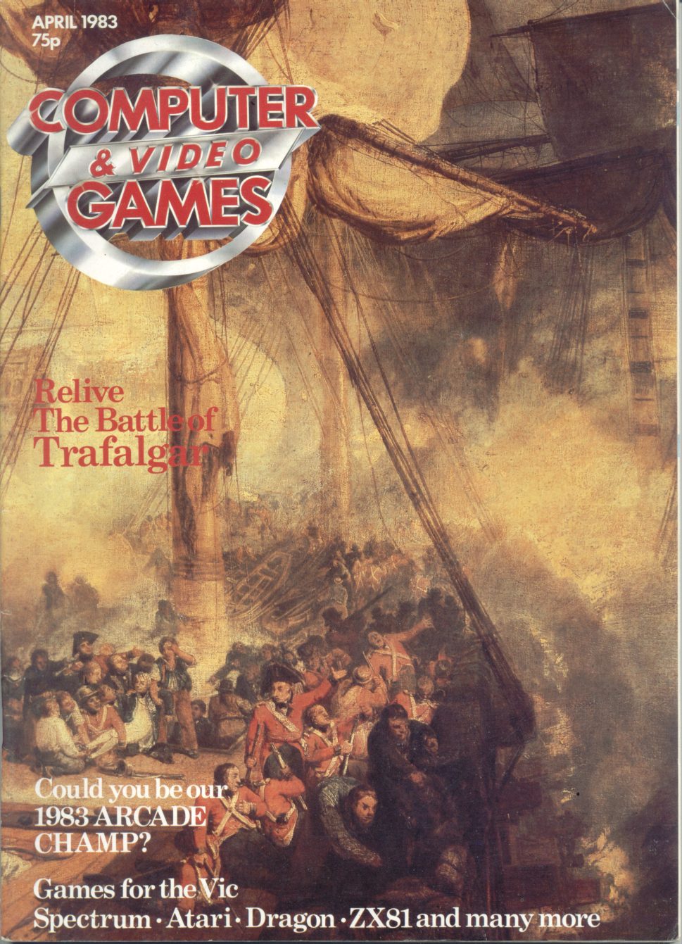
Recently seen in tiny thumbnail form
in another RG feature, this stunning April 1983 cover wasn’t daubed
by one of C&VG’s own brushsmiths. In fact, it was painted around 175
years before the magazine even existed – it’s a detail of “The
Battle of Trafalgar, as Seen from the Mizen Starboard Shrouds of the
Victory”, painted by the English Romantic artist J M W Turner to
commemorate the famous naval victory. The original can currently be
seen in the Tate Museum. Luckily, by the time C&VG came to pinch it,
the copyright had expired…
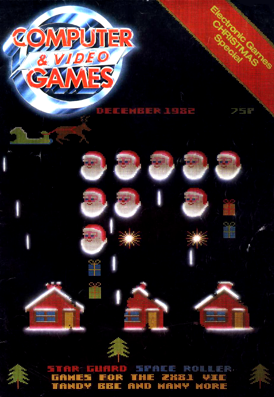
John Thompson created this classic
Space Invaders theme for the 1982 Christmas edition, which
highlights one of the saddest losses of the modern era of mag
publishing compared to old-style reproduction. When games are
photographed rather than screen-dumped, you capture the scanlines of
a TV screen, producing the distinctive “pixelisation” that gives the
image an evocative glow. It looks so nice that most emulators for
the PC (which displays via scanline-free monitors), actually offer
an option to simulate the scanlines to make the games look more
authentic.
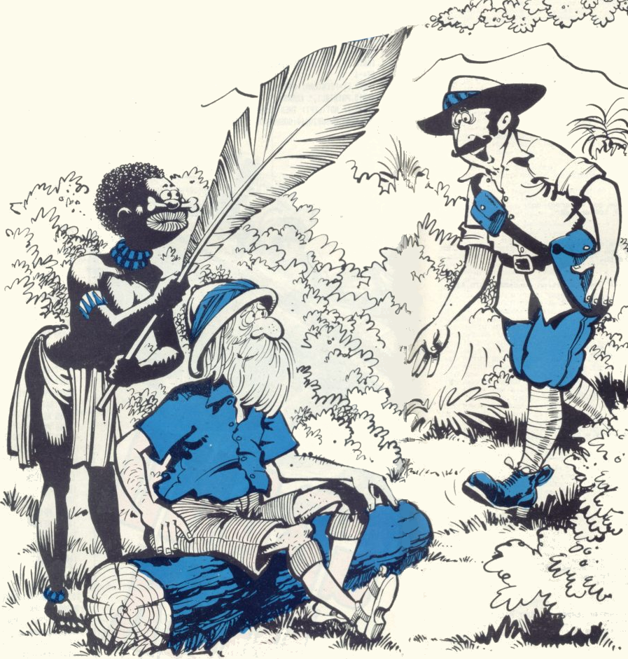
One of C&VG’s stalwart artists was
Dorian Cross, whose caricature art usually enlivened several pages
of every issue. For issue 8, just in time for the start of the 1982
World Cup in Spain, he came up with this spectacular 3D sculpture in
latex rubber, which predated the eerily similar puppets of Spitting
Image by two years.

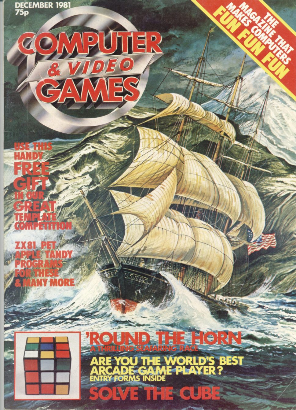
Apparently, this inventive cover by
Linda Freeman made a serious dent in the sales of the October 1982
issue it adorned, as slow-witted readers confused the mag for an
actual newspaper and failed to buy it. It’s often credited in the
publishing business as the reason people don’t do newspaper-spoof
covers any more.
Returning to the nautical theme, the
Tony Gibbons cover for Issue 2 also showcases a trait shared only by
a very few covers, but which demonstrates the incredible commitment
to illustration that early C&VG had. Not only would they commission
someone to produce a full-colour original painting for the cover,
but they’d also get someone else to draw a reproduction of it to
use on the ‘Next Month’ page. Now THAT’S dedication.
------------------------------------------------------
THE POWER OF SUGGESTION
(Part 2)
------------------------------------------------------
My personal favourite of C&VG’s roster
of artists is Dorian Cross. His bulbous, cartoony figures carry a
very British air of the downtrodden misfortunate, in the tradition
of Tony Hancock, Fawlty Towers, Steptoe And Son or (for our younger
readers) Mr Bean. The following three images show how he could manage to load atmosphere and
pathos even into three of the most basic staple games of the
magazine-type-in genre. The ostensibly racing-themed ZX81 game
Dodgems is
in fact nothing more than a variant of those electronic toys where
you have to guide a metal hoop along a wire without touching it:
But illustrated by Cross it’s suddenly
imbued with a dramatic backstory, where the hapless driver finds
himself at the wheel of an out-of-control racecar (not entirely
dissimilar in design to the ZX81) which appears to
have left the track and is mowing down terrified spectators. This,
you realise, is the human tragedy that awaits if you can’t keep your
car on the course.

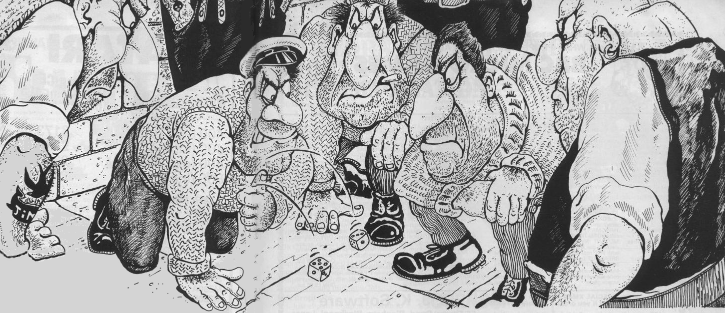
How on Earth do you make a Yahtzee
game seem interesting when there’s nothing more exciting in it than
a handful of dice? Well, you could portray it as being played by a
scurvy gang of scowling merchant seaman on a dockside. Lose this
game and shudder at the all-too-easily-imagined thought of what
might befall you if you can’t pay up on your wager.
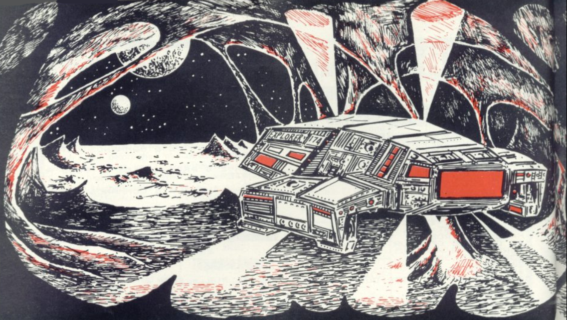
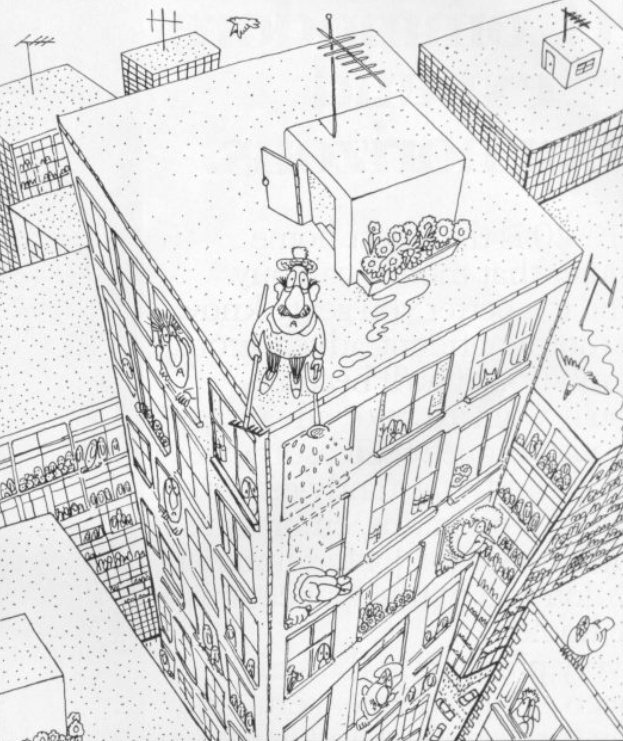
This is my absolute favourite, though.
The “City Bomber” game was an ever-present fixture throughout the
entire era of the type-in listing (though it was also released
commercially - we’ve pictured Jeff Minter’s version). In it, you
pilot a bomber aircraft which is inexorably spiralling out of the
sky, and can only survive by literally bombing flat the city beneath
it to provide a landing strip.
Given this timeworn concept to
illustrate, Cross hit upon with the genius of representing it from
the previously-unconsidered viewpoint of the unfortunate inhabitants
of the skyscrapers below, gazing up in bemused horror at the
catastrophe about to befall them. The detail of the puddle of water
trailing from the tiny window-box to the edge of the building is
heartbreaking, and not until the release of The Getaway on the PS2
twenty-odd years later would gamers be forced to confront the
dubious morality of their actions in such a way.
----------------------------------------------
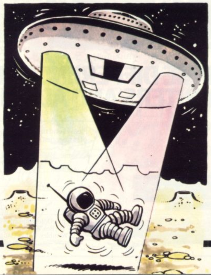
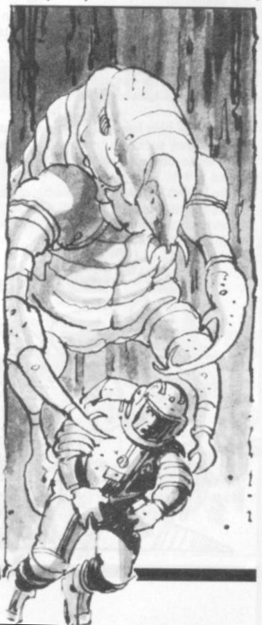
I'LL NAME THAT GAME IN ONE
----------------------------------------------
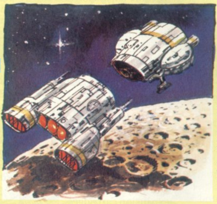
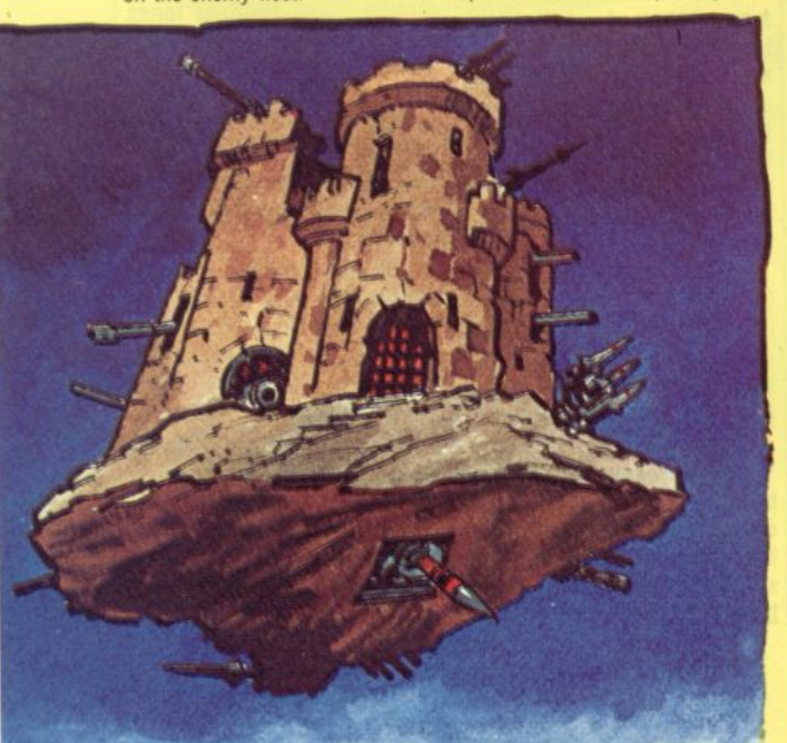
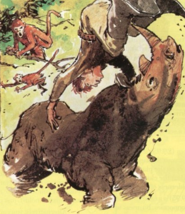
ROUND 1
C&VG was the only magazine in the UK
that gave any kind of coverage to arcade gaming, in the form of its
monthly two-page column Arcade Action. Arcade owners didn’t tend to
want photographers getting in the way of their coinslots for hours
at a time, so Arcade Action was almost solely illustrated by custom
artwork. Can you identify these classic coin-op games from the C&VG
artists’ impressions of them? And just to make it harder, we’ve
thrown in a ringer – one of the images is of a home micro game, not
an arcade one. (Answers at the bottom of the page.)
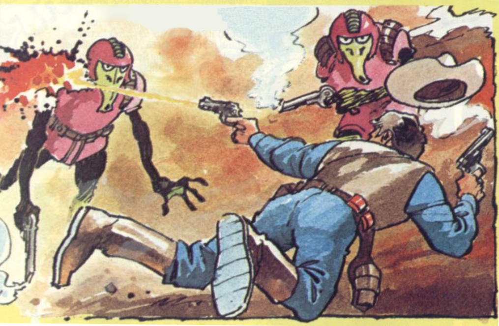
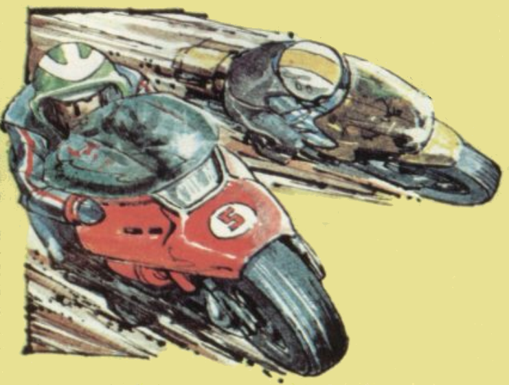
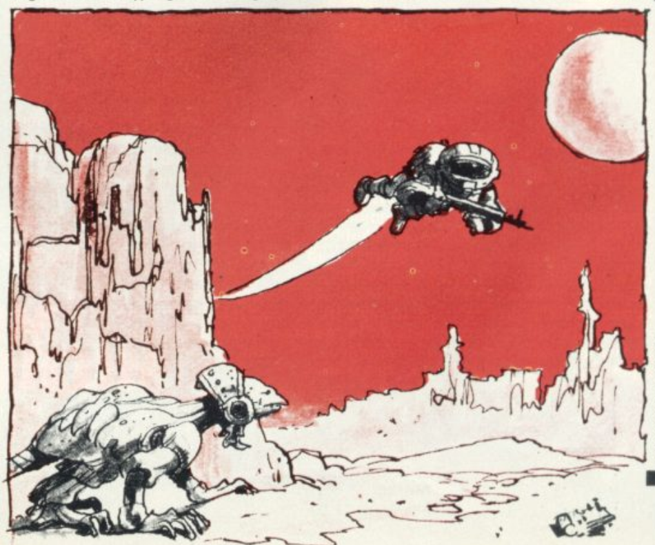
ROUND 2
When a game was popular and therefore
mentioned in several issues of the magazine, C&VG would often hand
the job of illustrating it to different artists each time. Which
well-known space blaster is the subject of these very different
interpretations?
-------------------------------------
WHERE ARE THEY NOW?
-------------------------------------
The tragedy of this story is that, as
far as your reporter is able to ascertain, almost all of the C&VG
artists of the 1980s have disappeared off the face of the Earth.
Despite a month of intensive searching, in almost every case I
couldn’t track down the slightest trace of them still working in any
kind of illustrative field.
The only one who went on to any kind
of fame or fortune related to the games industry was Bob Wakelin,
who drew for the magazine in the latter parts of the decade and
later became very well-known for his work with Ocean Software, but
none of the creators whose work appears in this feature could be
found working either in games or publishing, with the exception of
Bugs creator Elphin Lloyd-Jones (who is, it has to be admitted, by
far the easiest one to Google), who now paints and exhibits on
canvas in a style not far removed from the English Romantic work of
Turner (see Front And Centre), as well as
illustrating children’s books and working on late-80s TV cartoon
Telebugs. It’s nice to think that at least something of the spirit
of the Bugs survived…
QUIZ ANSWERS
| Scramble |
Moon Cresta |
Dig Dug |
Zaxxon |
| Robotron |
Jet-Pac (ringer) |
Congo |
Tron |
| Time Pilot |
Qix |
Elevator Action |
Amidar |
Round 2: the game is Defender.
|