
|
|
LESSON ONE
"They made me do it, your honour."
If they spend any amount of time browsing
through World Of Stuart, alert readers may well find themselves noticing a
number of recurring themes popping up throughout its pages, and one of the
commonest is a violent contempt for nearly all videogames journalism. This
is because, not to put too fine a point on it, nearly all videogames
journalism is a crime against
humanity. (Either in the literary, ethical or sociological senses, and
usually all three.)
Practiced largely by cynical-yet-incompetent
careerists who regard themselves as essentially the games industry's
door-to-door salesmen - rather than as a safeguard standing between
the industry and the public, protecting consumers from wasting their money
on terrible products - the dismally low standard of nearly all videogames
journalism was and remains the reason why your correspondent felt the need
to take the job on for himself, so that at least on occasion it might be
done halfway-properly. And if the 14-years-and-counting career that
followed that decision isn't a reason to hate videogames journalists, then
this reporter doesn't know what is.
(And you can take that sentence any way you
like.)
Anyway, such a decision wasn't made hastily.
It took several years of cowardice, incompetence and stupidity on the part
of the nation's gaming hacks to drive your reporter to such drastic
action, and in particular a handful of cases representing such a gross
dereliction of journalistic duty in their discrepancy between the
published reviews and the actual truth that no conscientious human being could allow the
situation to continue without trying to do something about it. So if you ever
wanted to know who to blame for World Of Stuart and everything it stands
for, here (in descending order of hideous evil) they are.
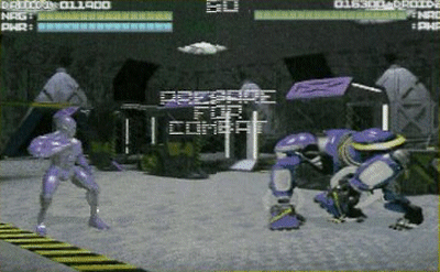
Astoundingly, this game does NOT appear in the following
article.
|
|
1. Kick Off 2 (Atari ST, 1990)
Well, duh. This one's been covered in
some considerable detail
on WoS already, of course, but I'd actually forgotten that my first
encounter with the Kick Off series was with the Atari ST version,
which is a whole additional world of pain compared to the more
successful Amiga incarnations of the game.
Along with the Amiga, the ST
represented the cutting edge of computing technology at the time, so
you wouldn't imagine that a simple overhead-view football game - a
slab of green, a few white lines and two or three small sprites -
would make excessively onerous demands on its state-of-the-art
hardware. You'd be wrong, obviously.
Kick Off 2 on the Atari ST represents
perhaps the most inept standard of programming ever seen in a
chart-topping game. The demands of drawing any curved lines were far
beyond its capabilities, so the pitch was rendered in straight lines
only. (As if the zoomed-in viewpoint didn't make it hard enough to
tell where you were already, the lack of a centre circle,
penalty-box arcs etc left players with the impression of being lost
in a dream sequence from The Prisoner.) Even then, depicting more
than one white line at a time threw the coders into a panic,
so the goals were drawn as wireframe boxes to reduce the workload on
the poor straining CPU, a measure which still didn't enable the ST
to produce a steady picture.
World Of Stuart would recommend that
you play the Atari ST version of this awful, awful game for yourself
in order to fully appreciate the incompetence on display, but
doesn't want to be sued for the cost of new glasses when the strain
destroys your eyesight, or even for the horrible trauma of playing
Kick Off 2 generally. So just take our word for it.

(Above left) What you can't see on this
static screenshot - apart from the centre circle, which isn't there
- is the extraordinary flickering and shifting of both the green
colour bands and the white lines.
(Above right) Yes, that
curious construction at the bottom left is indeed supposed to
represent the goal. With this many lines to draw on screen, the
game's flickering by this point ramps up to a level where it's
capable of sparking an epileptic fit in unwary viewers.
|
|
2. Rick Dangerous (Amiga, 1989)
Ah, good old Rick Dangerous. Beautiful
graphics, buckets of character, wonderful atmosphere, clever and
smooth controls - the sort of game you're absolutely desperate
to love. What a bummer, then, when it turns out to be one of the
most contemptibly badly-designed videogames in the history of the
universe.
Though it looks like a platform game,
there's no running-and-jumping skill required in Rick Dangerous at
all. What happens is that you walk along for a bit, something
appears out of nowhere and kills you, and then you get sent back a
few screens and play it again, this time remembering not to climb up
that particular ladder, jump across that particular gap or whatever.
Since there's no skill and hence no fairness, the player is in
effect reduced to the status of one of Pavlov's dogs, punished or
rewarded at random for illogical and inconsistent actions. (On one
screen, pressing a button will cause a lift to operate, carrying you
to the next area. On the next screen, pressing an identical button
will cause a giant spike to spring straight into your head.)
Of course, games being rubbish is just
one of those things that happens. Luckily, we have professional
reviewers to warn us that lurking behind the pretty graphics on the
adverts is a wretched, miserable, frustrating cheat of a game, and
save us from wasting our hard-earned cash. Phew!
Rick Dangerous scored an average
review mark of 89%.
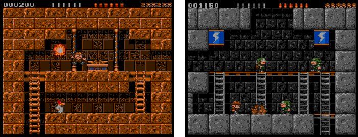
(Above) Do not be tempted by the pretty
graphics. Rick Dangerous will make you want to be dead. Especially
do not buy the new mobile-phone version, as mobile phones are
delicate and react badly to being hurled against walls.
|
|
3. Rick Dangerous 2 (Amiga, 1990)
And then when the sequel came out -
implicitly admitting the failings of the original by, for example,
allowing the player to play in any of the game's five areas to avoid
the murderous frustration of being repeatedly unfairly killed on
Level 1, (but leaving the central crippling flaws of the gameplay
completely intact) - the useless, cretinous morons of the games press
still didn't pick any of it up, and gave Rick 2 even higher
scores. Gah.
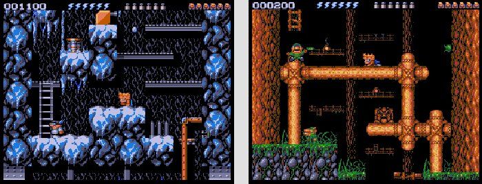
(Above) More of the same, but without a
hat.
|
|
4. Zoids (Spectrum, 1986)
The
review of Martech's toy-licence Zoids in the February 1986 issue
of Crash is one of the longest- enduring mysteries of the 8-bit era,
and another event which cemented your reporter's determination to
infiltrate the world of games journalism and bring JUSTICE to the
GUILTY within it.
Crash was famously the most strict-marking and ethical of the
Spectrum magazines. Martech were a small company who didn't have a
noticeably large advertising budget with which to threaten the mag's
editorial integrity. And Zoids is completely
shit. So where the Jesusing frig did a review score of 96% come from? To this day,
nobody knows, but rest assured that your reporter's lonely 18-year
quest to find out will continue, until enlightenment or death.
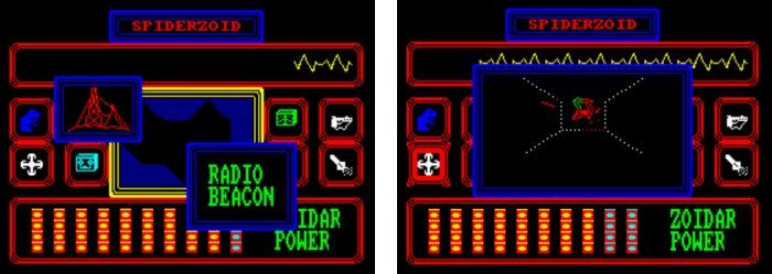
(Above) Zoids - feel the thrills.
|
|
5. Turrican (Amiga, 1990)
Look, it's not that Turrican is
rubbish. It's okay. It has lots of stuff to commend, like the neat
weaponry and all the secret bits to find. It's just that it's not
that good. It's huge and it's bland and it's repetitive - what's
the point in having a level 1000 screens big if they all look the
same and you never know where you are, and hence never feel like
you're getting anywhere? So the extraordinary regard
in which it was - and often still is - held, by reviewers and geeks
alike, demeans us all. Somebody had to say it.
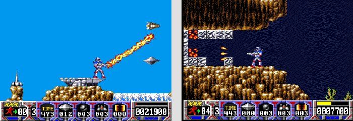
(Above) Turrican is great for the first
hour or so - flamethrowers, spinning bomb attacks, hidden bonuses
and all-action exploring. Then stand by for about eight more
increasingly-dispiriting days of screens exactly like these two.
|
|
6. Golden Axe (Amiga, 1990)
The ruin of the arcade game started
here. Trudge trudge trudge, fire-button fire-button fire-button,
trudge trudge trudge, die, insert coin, trudge trudge trudge, repeat
until game complete or your money runs out. The cynical shift in the
concept underlying arcade games went completely un-noticed by anyone
in the games press, either when they covered Golden Axe's original
arcade release or when it came to the home machines.
The Amiga port is
actually a faithful and competent conversion of the coin-op - the
accuracy perhaps blinding the era's reviewers to whether the thing
that was so accurately replicated was deserving of replication in
the first place - but it
makes this list anyway because (a) the votes of others
embarrassingly got Golden
Axe into the first-ever Amiga Power All-Time Top 100, and (b) the
home-only sequel Golden Axe 3 (exactly the same game with new graphics)
was subsequently reviewed by Mega magazine in the same issue as the
toweringly fantastic Gunstar Heroes, and got a better score.
Neither of which reasons are
particularly fair on Golden Axe, but that's life.
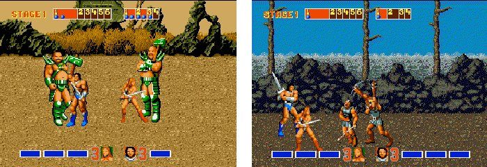
(Above) Golden Axe - proving that copying
rubbish perfectly just leaves you with twice as much rubbish.
|
|
7. Xenon 2 (Amiga, 1989)
"Hey! These guys
are wearing shades! They can do shiny metallic-looking graphics!
They've copied the music from a cool film! They must be the videogame version of rock'n'roll stars! Quick, pretend that we haven't
noticed what a slow, dull, unbalanced and unfair nerd's idea of a
vertically-scrolling shoot-'em-up they've written! Give it
94%!"

(Above left) What Xenon 2 pretended to be
like.
(Above right) How Xenon 2 actually was for most of the
game.
|
|
8. Out Run (Spectrum, 1985)
Here was perhaps the first example of
the games press proving itself unable to stand up in the face of a
major hype campaign. Out Run, US Gold's big hope for the 1985
Christmas rush, had more money spent on its marketing push than any
game before it in British computing history, with months of
advertising working magazine readers into a frenzy with what turned
out to be mocked-up screenshots.
The game itself was a near-unplayable
disaster - catastrophically slow, with a nightmarish multiload
system. Yet all the mags bottled out of upsetting US Gold's
expensive applecart, and bowed down in front of the then-mighty
publisher with 80% reviews proclaiming that the conversion was,
while imperfect, the best job the poor little Speccy could be
expected to make of such advanced arcade hardware. (An assertion
which would later be comprehensively destroyed by Ocean's
magnificent port of Chase HQ, voted by Your Sinclair readers the
best Spectrum game of all time.)
Your correspondent would subsequently
personally encounter several of the intimidatory tactics US Gold's
senior executives used to employ to try to ensure favourable
coverage, but none of them justified the cowardly treachery
displayed by the reviewers of Out Run. (To be fair, many of Crash's
reviewers were unpaid schoolboys and can be forgiven for lacking
some steel. The adults, on the other hand, have no excuse.)
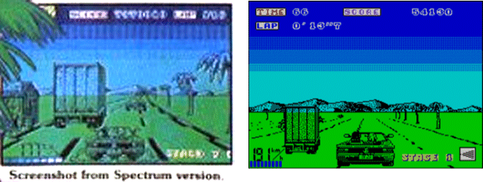
(Above) The advertised and real versions of Speccy
Out Run. Note, for example, the huge truck and bold road markings of
the faked screenshot, and the piddly reality. Done that? If so,
you're already a better games journalist than anyone who reviewed
it.
|
|
9. 1943 (Atari ST, 1987)
This one's a little different from the
other games in this feature, in that it didn't score especially well in reviews (just 45%
in The One, for example), and in fact it's not all that bad a game.
The aggravating thing about 1943 was that, like Out Run, it was
blatantly fraudulently advertised, to the considerable detriment of
anyone who forked out their money for it (there were no 10-day
refunds in 1987), and nobody in the games press
seemed to either notice or care.
The "Atari ST screenshots" in the 1943
ads showed a much better-looking version of the game than the one
you could actually buy, and most strikingly of all the ads showed
the conversion in action complete with the coin-op's simultaneous
two-player mode, a major selling point of the game which in fact
didn't make it to the home ports. So what the heck happened between
the preview shots and the real release? As a disgruntled gamer I
wanted answers, only to find that the magazines I was trusting as my
protectors
weren't even asking the questions.
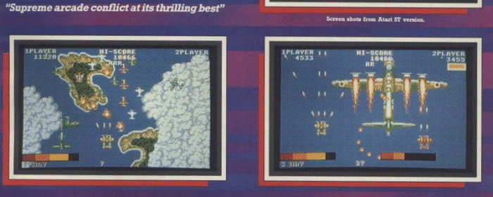
(Above) 1943 as it was advertised to salivating Atari ST owners (that text at top right says "Screen shots from Atari ST version"). Note the impressive graphics and two-player play.
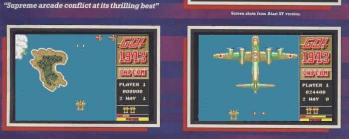
(Above) 1943 as it SHOULD have been advertised, ie
how it really looked at the same points in the game. The big bomber
is at the same stage of destruction as in the top screenshot,
incidentally, but the dramatic plumes of flame never make an
appearance.
|
|
10. Nightshade (Spectrum, 1985)
Something different again with this
one. Until late 1985, Ultimate Play The Game (the company who'd
later go on to become Rare) could do no wrong on the Spectrum. Every
game they'd ever released had marked a new pinnacle of Speccy coding
and game design, and they were the uncontested masters of all they
surveyed.
And then they released Nightshade.
An awful, tedious plodaround of a game
(walk around slowly on a 2D plane, collecting different kinds of
bullet to shoot at different kinds of baddie, and that's about it),
enlivened only slightly by Ultimate's trademark graphical skills
(and even those were largely nullified by a display system which as
often as not meant most of the screen was simply inky blackness with
a few diagonal lines across it), Nightshade was the start of a long
and steep slippery slide which would see the Ultimate name almost
completely devalued before it was obliterated entirely as the
company sold up to US Gold and scurried off to make cart games for
the NES as Rare.
Unfortunately, though, the videogames
press seemed unable or unwilling to acknowledge that their kings had
stepped out for a stroll in the buff. While the words of the
reviews seemed to tell a different story, all the games mags poured praise on Nightshade anyway, with Crash giving it 91% (Your Spectrum made it Game Of The Month, which
meant - as was the mag's odd custom at the time - that it didn't actually get a score), and such criticism as there
was was cretinously stupid (one Crash reviewer, for example,
complaining that it was just like Knight Lore and Alien 8, two games
which Nightshade resembles by being displayed in isometric 3D and in
no other way whatsoever).
Clearly, the games press needed
someone who could review games, not reputations.
I had such a cushy career all
lined up in the Diplomatic Corps, too.
No, really.
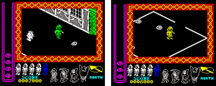
(Above left) A relatively pretty screenshot
of Nightshade, for fairness' sake.
(Above right) What the
game actually looked like on screen most of the time, showcasing the
spectacular visual splendour which led Crash to give it 94% for
Graphics.
|
| |
Comments? WoS Forum
|

